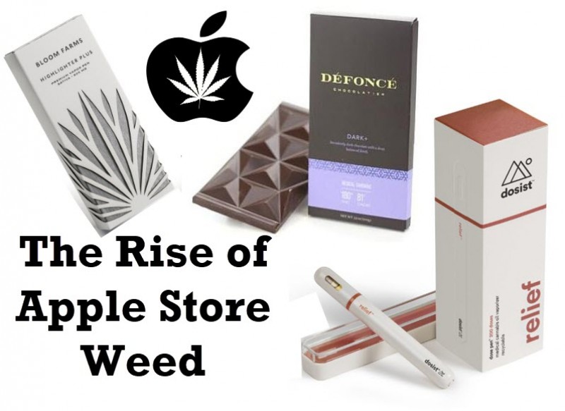
Apple Store Weed – Why Do Cannabis Products All Have to Look Like Apple Products

Sleek.
Slick.
Clean.
Those are the words that the world used to describe the iPhone and later the opening of Apple stores around the world. The look changed a generation and the expectations of what is cool and what is hip. Now, all those first-generation iPhone kids are all grown up and running marketing and ad companies. They are obsessed, even at a sub-conscious level, with creating products that look and feel like Apple products, even if there is weed inside. MedMen, the infamous retail cannabis chain that recently got poked fun of on the hit comedy show South Park, based their entire retail experience on being the “Apple store of Weed”. At Cannabis.net we have done dozens of interviews with start-ups, which are generally led by people between the ages of 23 to 33, who have used the “it looks like it is from the Apple store” phrase to describe their product or idea.
Is creating your cannabis product to look like it belongs in the Apple store a good or bad idea? The common supporting line is that if you want people between the ages of 22 to 35 to buy your product, and they love Apple products, you should make your product look slick, sleek, and clean. The idea will resonate with them, even at a sub-conscious level.
Unfortunately, that demographic tends to make about $40,000 a year, carry $5,000 in monthly credit card debt, have on-average $36,000 in student loan debt, and over 40% live at home with Mom and Dad. That is just one reason you may not want to make them your target audience just yet.
What is the problem with Apple store looking cannabis products?
There are a few problems with creating cannabis products to look and feel like Apple products. The first is that Apple is a tech hardware company, not a consumer inhalation or edible company. You don't put Apple products in your mouth. How many food companies have designed their products or snacks to look like they came from the Apple store? If there are a few, it is not the norm, so why didn’t food companies jump all over the Apple design trend?
The second problem is that cannabis is a plant. It is a bit messy; it smells, it needs constant care in the growth cycle, it is more like a tomato plant or broccoli then a tech product. Why make the packaging of great tomatoes look like iPhones? If we walk down the simile road, shouldn’t cannabis be packaged like really high-end Scotch or cigars? The product is much closer on the family tree to those to products than a set of Beats’ headphones.
There is a generation of marketers out there whose lives have been greatly influenced by Steve Jobs and Apple products. They are wonderfully designed and yes, they are clean, sleek, and slick, but do those three words come to mind when you describe cannabis or how you want your cannabis?
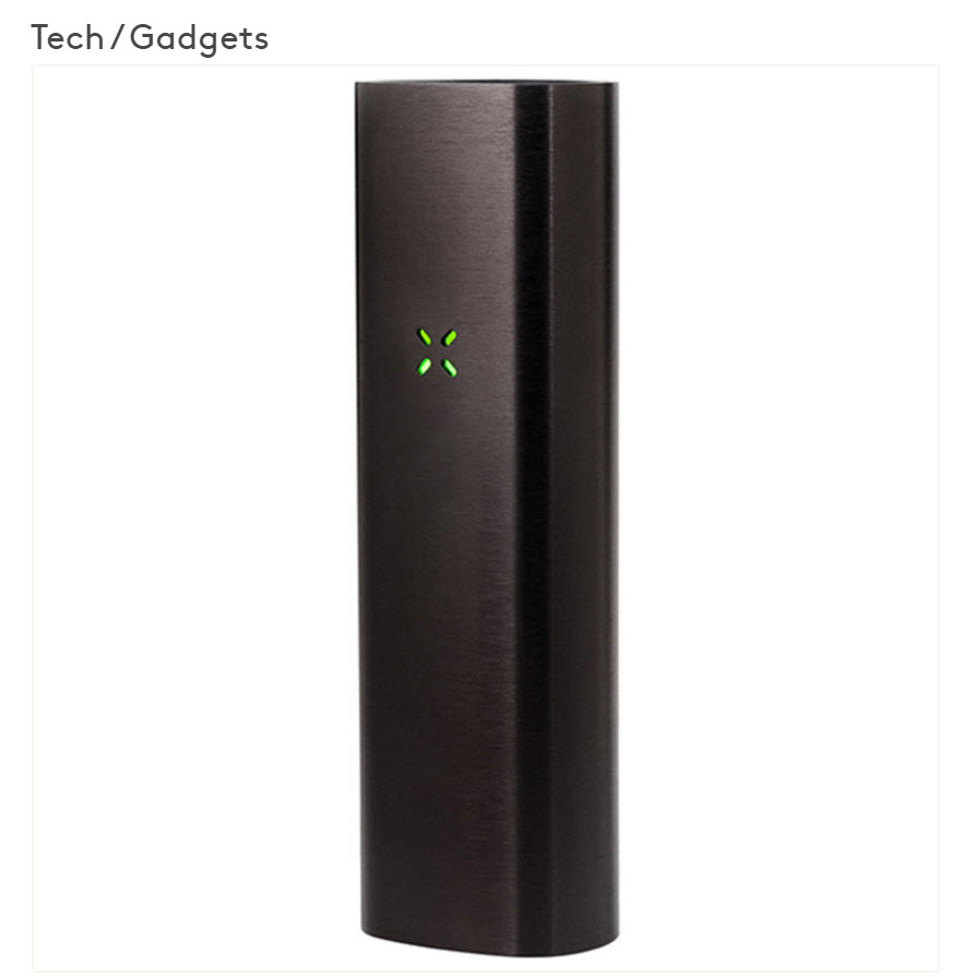
One funny story was about the Dosist vape pen pictured above, they were called HMBLT when they started and we covered their Las Vegas launch party. We all pulled out the pen which was super sleek and touted "exact dosage with each puff for medical purposes". After 15 people tried the demo pens, we all loved them as the pen would vibrate at the exact dosage in your lungs and stop sending vapor through the pen. The one comment everyone had about the design was that it looked like you were sucking on a tampon. It is an elogated, all white, rounded pen that looked 98% like a tampon. Hence, maybe the Apple design going in your mouth needed some tweeks.
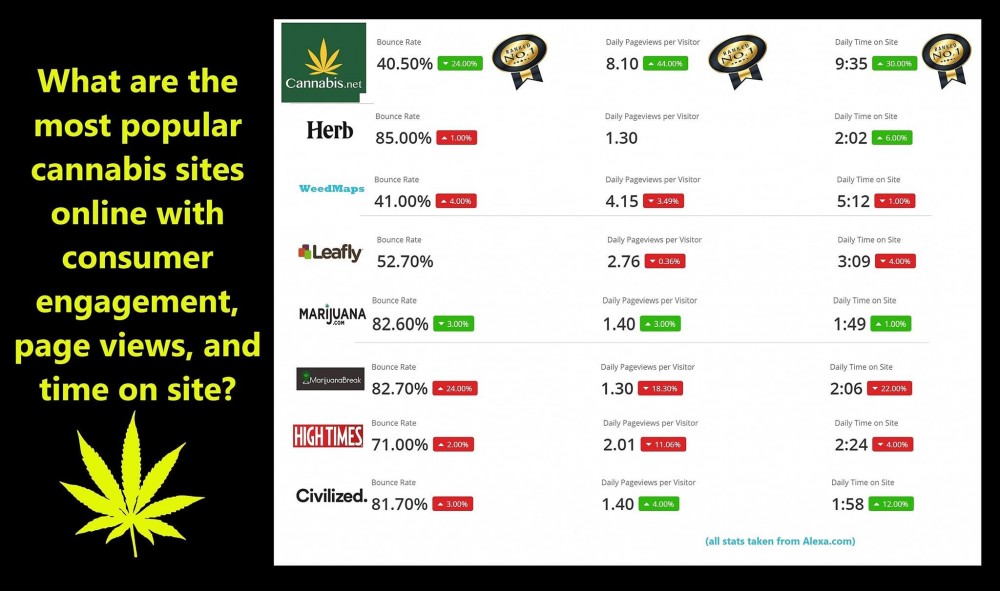
One of the funnier conversations I had with millennial marketers was doing a review of our website at Cannabis.net . He explained to me how websites need to be clean and sleek and how people don’t like clutter anymore, just like an Apple store. When I asked if he had any data for me to look at to prove that point, he got "millennial annoyed" and said the Cannabis.net site looked like it was from 1984. I had to chuckle and I sent him over the chart below that shows our time on site, duration of page views, page view sessions, bounce rate, and engagement of Cannabis.net was in some cases 400% better than all the clean, sleek, and slick cannabis millennial websites out there. I just asked “So, you want me to copy all those websites who are doing 400% worse than our site because that is what people enjoy and want?” That was the last conversation we ever had.
So, what is the answer?
Yes, there will be a swath of consumers who want their cannabis product packaging to match the iPhone in their purse and their iPad at home. They will want their vape pen or edible’s packaging to look like it came from the Apple store. Those consumers will generally have a higher average spend at the dispensary, will care more about appearance, and will see the cannabis product as a reflection of themselves, in the same way they see Apple products.
How big will that swath be is where I will differ from my millennial marketing friends. When you think about the “Stoner Cheech and Chong crowd”, that demographic wont care about packaging and will be very influenced by the actual product performance. Seniors are the largest growing cannabis segment in the country and the Baby Boomer Generation has the most money in the history of mankind, do they want cannabis products to look high tech and Apple-like? I don’t know about your Mom and Dad or grandparents, but they won’t care what the packaging looks like as long as the product is a fair price (older people ar much more price conscious than style conscious), and helps them with their arthritis, anxiety, sleep-aid, or sore back and hips.
Remember as you design your sites and products for the cannabis space that iPhones are about 8% of the world smart phone market and dropping fast as smart phones become more and more homogenized like PCs did in the 1990s. Apple computers make up about 1% of worldwide sales and iPads have seen declining sales for years. Does that mean Apple doesn’t have billions of dollars in the bank and billions in sales? No. It means that 99 out of 100 people, and that is being generous, do not own an Apple product and do not go into Apple stores.
You can try and thread the needle for your cannabis site and product and get the Apple fans hooked, or you an make a safer bet on the other 99.999999% of the world.
If I had to give out one free tip based on our data, it is to design a product to be discreet as opposed to slick, clean, and sleek. Unless you are in Colorado or California, most cannabis users still live in areas where discretion is much more important and valuable than sleek and hip. Many people still worry about the social stigma and the "rolling of the eyes" when they say they use cannabis, as opposed to how compact and high tech their vape pen looks.
Go practical and solve a pain that your potential customer has and is willing to pay you to solve it.
Leave the cream white, rounded edges, lite up logos to the guys who make cool phones and watches.
What do you think? Are cannabis products that look like they came from the Apple store the future or just a small segment niche going forward?
SLICK, SLEEK, AND APPLE, READ THESE...
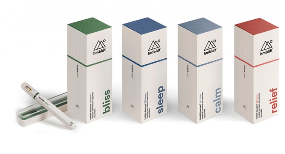
WHAT ARE DOSIST (AKA HMBLT) VAPE PENS, CLICK HERE.
OR..